 Although Blizzard 2016 didn't break the record set in 1996; with 33" of snow, it was a spectacular event!
Forced to hunker down Saturday and listen to the winds batter the side of the barn, I made the most of it by casting on the Ursula Cardigan from The Colours of Shetland collection. Of the five major patterns in this collection, I've already knit the Stevenson Sweater, using a combination of Shetland wool from Uradale Farm and J&S, and I have the yarn for the Puffin Sweater and the Scatness Tunic. So when Clare, from NH Knits, suggested an Ursula KAL, I jumped!
I absolutely love working with Shetland yarn. It has an earthy smell with "just off the sheep" under tones. While the yarn looks ethereal in the ball, a few rows on the needles reveals its robustness. This is strong yarn meant to protect strong folks from the strong North Sea weather.
Kate Davies's Ursula Cardigan is named after naturalist and author, Ursula Venables. She and her husband became crofters at Loch Spiggie and wrote, what I can only assume is, the definitive book on the birds and mammals of Shetland. As I knit my cardi, I'm reading her 1956 book, Life in Shetland: a world apart
"Up here in the north isles, we live like hibernating animals. We work at fill stretch through the brief months of summer and then retire for a while on our winnings. Shetland is little more than a battered ship riding out in the Atlantic....In October or thereabouts, when the year somersaults into winter, life disappears below into the entrails and cabins, and for days on end you would think the ship deserted. Salt scours the decks, draining off the warm, full-blooded colors of summer till only their neutral ghosts remain." (Venables 133)
I find inspiration for my Ursula in Venables's description of Shetland. Today, in the midst of this nor'easter, my corner of Pennsylvania feels a great deal like the north isles Venables describes. When I take Mazzy out for a walk, she is swallowed by the snow already on the ground. While she decides how to proceed, I am struck by the stillness- the complete absences of normal animal and human sounds. Instead of the psithurism that usually accompanies Mazzy and I on our daily walks, all I can hear is the pugnacious howl of the wind rising and falling in the our backyard and all I can see is the plump snow flakes falling from the thick clouds blocking out the sun.
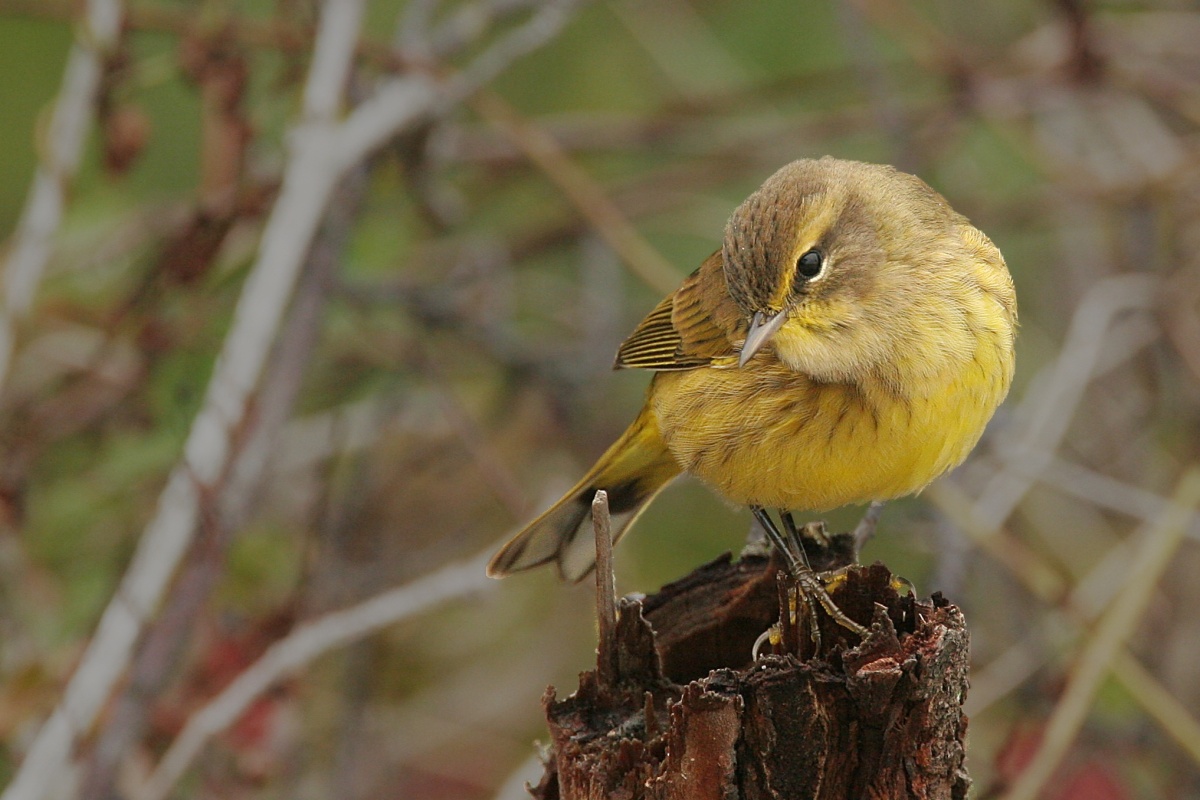 |
| https://upload.wikimedia.org/wikipedia/commons/6/69/Palm_Warbler.jpg |
It was also easy to choose CC1 and CC2. While J&S doesn't typically name their colors, there is at least one yarn supplier out there who does. When I saw "rhubarb pie heather", I knew it would be one of my contrasting colors; the name immediately evoked memories of my grandmother's strawberry rhubarb pie- in my family, a sure sign that Spring has sprung! Predictably, a purple, reminiscent of my Japanese irises, is CC2.
 Choosing the third color, however, was difficult. I swatched with Jamieson's sunrise. While this is another of my favorite colors, the brown undertones reminded me more of the mud synonymous with approach of spring rather than the stirring of life. Consequently, I pulled out my J&S color card and picked four blues that I hoped would work. Susan, from Raza Wool, shipped them immediately and a couple of days later I was agonizing over which to use. While I spent 45 minutes arranging the colors in value sequence, twisting each blue with the yellow, and taking photographs with the black and white filter to assess contrast; Bill sat down at the table and took approximately 5 seconds to select the blue he thought would work: shade 29mix. According to the little color theory I know, Bill's blue should not have worked, and of course, I promptly informed my husband, who earns his living choosing just the right color for very picky clients, of his mistake. To my inexperienced eye, shade 29mix did not appear to be sufficiently different from 121mix; in fact, when twisted, they blended together leading me to believe that they would not work as pattern and background. I realized my mistake a few rows in with the blue I stubbornly chose. With the third color, shade 29mix, finally chosen, I learned a lesson that I often teach in my psychology class- theory, any theory, is just an idea that should work most of the time but doesn't work all of the time.
 ETA: I originally typed this post on my iPad using the blogger app; unfortunately, the app crashed and my work was lost. I have tried to reconstruct the original essence of my post; helped along the air of authenticity Monday's terrible storm provided. The only benefit to my technological kerfunkle is that I am almost finished with my second repeat, and, therefore, able to post a photograph of Ursula further along her journey. I also appreciate getting to show how 29mix behaves. In the photo of the four blues, 29mix is second from the top. It functions well with the yellow, pink, and purple, affirming the arrival of spring!